The Artwork
The Story of the Album Artwork....
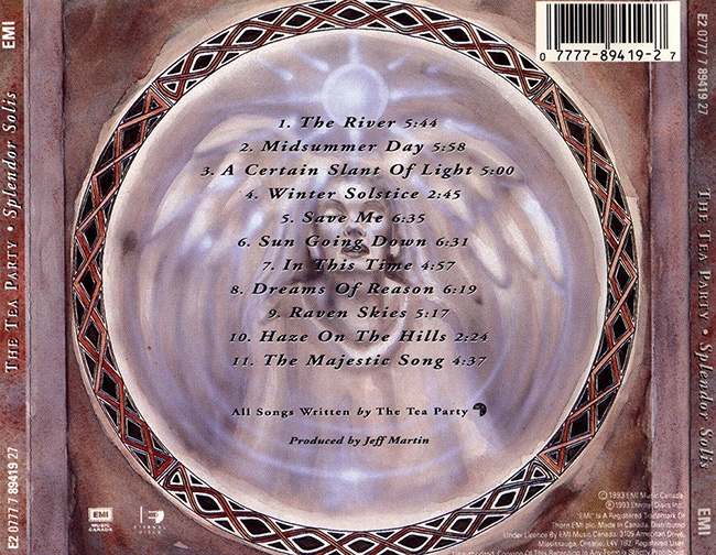
The cover for Splendor Solis was done by Steve Cole, a friend of the band who lived in the same town as them and was a regular vistor of their early live shows.
Nowadays Steve is a Tattoo artist, located 45 min drive away from Vancouver. Check out his Tattoo studio here.
I had a chat with him about how the Artwork for Splendor Solis came up.
Steve, how did you know the band?
I originally met the band through common friends at their early shows. They used to play almost every weekend at a pub called the Coach & Horses in Windsor, Ontario. Awesome historic basement pub that unfortunately is long gone now. Saw them play there a few dozen times and we became friends. I did not know them in high school. Probably around 1992.
How did the cooperation come about?
The guys approached me right when they signed to EMI Canada. Basically asked I could come up with some imagery that might work with the music. We barely discussed designs. They wanted to see what I would come up with. The cool part is that the band fought to have an artist outside of the label work on the cover. EMI wanted to do everything in house with their own designers. The band wanted a more personal one on one interaction with an artist.
Were there any guidelines from the band how the cover should look like?
No real guidelines on the onset- just what I felt visually from the music. I had originally come up with a ‘Spirit of the Forest’ like creature with branches and mushrooms growing out of it. We decided quickly it was too dark. The next design was the final concept for Spledor Solis.
What inspired you to create the cover? It seems that the song “Raven Skies” had a big influence on the main motive of the artwork, is that right?
The music and the album as whole worked very seamlessly in how the artwork flowed from it. I listened to it on repeat for days start to finish. Once the vibe was established it all just flowed out. Raven Skies definitely had a graphic influence.
Did the alchemical manuscript “The Splendor Solis” from the Middle Ages play a role in the design? Not directly. But I had many conversations with Jeff Martin about ancient alchemy and the influence it had lyrically. I think it comes out a bit in the artwork.
Can you say something about the “technical” side of the creation of the picture?
Technically it was simply mixed media. Started off as quick pencil thumbnail sketches then transferred onto heavy watercolour stock. Watercolour, ink, acrylic and coloured pencils. Brush, pen, pencil and airbrush.
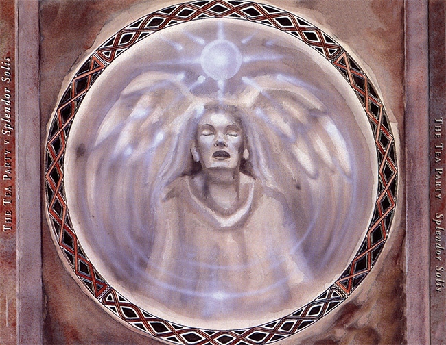
What is the story of the picture on the backside of the CD, which shows a woman with angel wings?
She came about as this concept of a spirit/angel coming into light. It was more of a nod to Renaissance art. Aside from the cover all the other pieces of the packaging had to be designed with room for the font/ writing. She was pretty sparsely detailed for that reason.


The first pressings of the CD came with a grey CD tray under which was hidden another graphic of an abstract painting with an eye in the middle and the words “All you are is in you”. Who had the idea for this?
Jeff Martin had the idea of hiding some artwork/ lyrics in the layout. We chatted about it and came up with an eye staring back at the viewer- hopefully promting someone to take the packaging apart to find the lyrics.
For the 20th anniversary the album was re-released on vinyl. It looks like the original artwork was no longer available and therefore they simply scanned the cover of the CD. Do you know if it was done this way? And are there any “outtakes” of the artwork?
I haven’t seen the vinyl cover in person. I’ll assume they used hi res scans of whatever the highest quality images of the cover they had. I don’t have any of the original pieces used for the cover. Everything is owned by EMI Music Canada. I’m sure Stuart has some laying around somewhere as well.
Did Splendor Solis remain the only cover you did for one band or did more follow?
I was fortunate to do lots of artwork for the Tea Party alongside the cover of Splendor Solis. EP/ Single covers, merch, drum skins, and some one off artwork for different markets (Australia etc)
When you look at the cover after all these years, what do you think? Are you still satisfied, or would you like to change something about it today?
I think of how fortunate I was at an early age that the band had confidence in me and to work on something so big that affects so many fans to this day. I just did the best I could at that time. It was also a huge honour to be nominated in 1994 for a Canadian Juno Award for Best Album Design. I’m very satisfied by the the outcome and that it has held up aesthetic wise 26 years later. But as an artist its easy to want to go back and modify some elements of it!
Thanks Steve!
Chapter II
The Story of the Website Artwork....
When I asked myself how the website for the Splendor Solis album should look like, it quickly became clear that the original artwork should play an essential role in it. I also wanted to get some “motion” into the main motif and thought of a so-called Parallax-Effect, where you split a graphic into several objects on different layers. The objects are then moved in relation to each other at different speeds, thereby simulating spatiality or movement.
The main problem was: the cover of Slendor Solis is square, but a monitor is rectangular, which means with the original Cover I wasn’t able to fill out the width of a monitor screen completely.
Because of this I had to extend the original artwork by myself. First step was to remove the font in Photoshop and came up with a very first rough design that looked like this:
While the first draft was far away from being perfect, I had the feeling that it could work out if I invest more time in it.
The next step was to think about how the image could look if the canvas was extended to the left and right. What kind of content would the viewer expect and what elements would make sense?
After playing around with some ideas in Photoshop, it quickly became clear that less is more! I decided that the original motif should stay in the center and the image should not be overloaded by too many other elements.
Next step was to sketch a rough scenario of the whole scene and then colorize it. The process of this can be seen here:
To be creative also always means to fail from time to time. The final scenario shown above is a good example of this. The colours are not harmoniously matched and appear far too vivid. Overall, the result looks overloaded and like a cheap comic or airbrush picture – but definitely not as it should be!
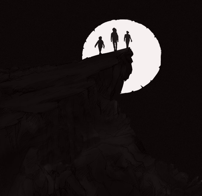
All back to zero! I re-visit my first sketch and develop the scenario from there. I decided to put a rock landscape in the foreground to give the image more depth. Step by step the picture took more and more shape. I myself am not an Illustrator and have extended the image mainly using the clone function of Photoshop until I eventually reached my limits, so that I decided to hire a real Illustrator to give the picture the final touch. That’s where Vali Lancea comes in. Not only did he do an excellent job, but his portfolio included an illustration that perfectly matched the album’s vibe and which I was allowed to use on this website as well (check out the Vault ).
Below you can find some various work-in-progess stages of the Artwork in random order.
Once the graphic was done, the only thing left to do was to split it into little pieces and add it to the website….
Enjoy! Marco
Download Wallpapers
Free to download and use* for your mobile and desktop screens.
If you miss a certain size, feel free to send us a note!
Desktop-Desktop
Desktop 1440 x 900
Desktop 1680 x 1050
Desktop 1920 x 1080
Desktop 1920×1200
Mobile Wallpaper
Mobile 412 x 847
Please not: All wallpapers are only allowed for private, non-commercial use and not allowed for commercial use, print or reproduction!


